Thursday, 27 February 2014

Editing The Rough Cut 1st Session // Post-Production

We started editing on Wednesday the 26th of February. As I mentioned in the last post our lesson started with one of the school's IT technician helping us out to be able to view and copy across our files.

Once that was done we looked through and watched all our clips while looking across the storyboard to see how our shots look on the computer screen and check the quality of them for the last time. We came across one error where you can see some of our equipment in the background. For our rough cut we will probably include it anyway but we may cut out this shot for the final edit.

We then started editing.

We decided to edit chronologically as it makes things easier and simpler to follow. Therefore we started with the writing that first appears and we made it on Live Type using the font Goudy Old Style and slightly editing the position of it in a way so we were happy with it. At first we thought we might make it appear on the screen like a type writer (as shown below) but then we decided we would stick with it fading in and out for now and see later on if we preferred to have it appearing differently.

 
During those two hours we also edited together some more of the clips and made slow, but steady progress.

Wednesday, 26 February 2014

Technician Needed! // Post-Production

When returning back to school on Monday the 24th of February Wilhelmina and Indya went to the media room to copy across the files for our opening so we could begin editing straight away in our first lesson on Wednesday. They had problems doing this as the files weren't being recognised so on Wednesday we all went to the IT technician and he sorted it out for us.

Friday, 21 February 2014

Evaluation of Filming


At the end of our day of filming yesterday we decided to film a short video of how the day went and we quickly evaluated some choices we'd made.

p.s again the music used was from a royalty free source (no copyright).

Thursday, 20 February 2014

The Making of Malediction (Behind The Scenes)

The other we did our first (and only) day of filming. We planned to do two days of filming but got it all done in one day! Here's 'The Making of Malediction (Behind The Scenes), enjoy!

 
p.s the music used in this video is from a royalty free source (it isn't copyrighted).

Wednesday, 19 February 2014

Shot Log


With this shot log we could keep track of what shots we'd taken and write down any extra shots we decided to do. As well as this the shot log made sure we looked back on the clip to check the quality was to a high standard.
 
As you can see we did our best to split the role of the camera operator equally. This was good as it gave all of us a chance to film. We also all took turns in directing and ensuring everything was right for the shot we were doing.

Tuesday, 18 February 2014

That's A Wrap!

Filming has finished all in just one day!

Wilhelmina and Indya arrived at mine just after 9am and we starting filming around 10am. We got all the outside shots done pretty quickly and then entered the house and did the majority of those shots. We had our lunch break at mine and then went back to the house around 2pm to film the final two shots.

We were originally using the tri-pod we borrowed from the school but we actually found my own one better as it was taller and had more options for the direction the camera could be moved on it. When we filmed the shots inside we used my tri-pod instead.

The use of the camera went pretty smoothly. The only problem we came across was when we were filming our shot when we wished to do a focus pull we couldn't get it to exactly work (even though Wilhelmina knows how to do it and has done it before). We tried to do it the best we could and hopefully it's come out alright.

As we managed to get everything done a lot faster than we thought we had time to do extra shots throughout the day of what we thought would look good to have in the opening. This should be good for our film opening as in the planned storyboard I don't think it is very long overall (so these extra shots should ensure it is at least 1 minute and 30 seconds).

After we finished filming we had a little time before Wilhelmina and Indya had to leave so we decided to record some creepy sounds of Wilhelmina laughing, crying, etc on my microphone which I can then edit and we may use in our opening.

Monday, 17 February 2014

Filming Starts Tomorrow!

I can't believe it's all come round so fast! My camera's charged, the props and costumes are sorted and all the equipment is ready at Wilhelmina's house.

After researching and going through the pre-production stage I feel completely ready to begin filming tomorrow, a bit nervous for how the day will go but I'm sure it'll turn out great.

After checking BBC Weather unfortunately right now it says it's going to rain tomorrow. This could be quite annoying when doing some of our outside shots or it could enhance them (I guess we'll see when we are filming tomorrow). That's just made me thought, if it's raining, is the camera waterproof? Maybe we'll need to be a waterproof jacket to put over it.. Ok, enough of my rambling, I should probably get an early nights sleep for day 1 of filming tomorrow, night!

Equipment

The equipment we will use to film are as follows;

A Panasonic HD camera. This is the highest quality camera the media department provided and will help us produce the best quality film we can.

 
 We will also use a tripod (I am unaware of the exact make at the moment as Wilhelmina has it at hers). This tripod will significantly steady the camera and allow us to pan and do still shots easily.

 
The memory card we will be using is a 16GB SanDisk Extreme. This is Wilhelmina's own memory card and will be very useful as it will have enough space for film and as it is HD it will store the footage we record on the camera at high quality.

Saturday, 15 February 2014

Some Changes We've Made

When we came to storyboard our ideas we are agreed that we wouldn't include Wilhelmina (the antagonist) singing an old nursery rhyme because we believe it would be quite hard to actually make it creepy and people may just find it funny. Instead we will stick with incidental music which creates enough atmosphere itself.

As well as this on our storyboard in shots 6, 10, 12, 15, 25, 26, 27 and 28 a door is shown. This door is very important for our opening as it is the entrance to where the antagonist is. When I went to do test shots I realised how the door knob on it was in fact on the left side of the door and not the right. This will change the compositions of some of our shots (especially when the door is being opened) but it will not dramatically effect our film opening.

What Could Go Wrong During Filming

We have permission to shoot in our location and Wilhelmina picked up the equipment we needed on the last Friday before half term.

As the days of filming are approaching I was thinking about how much I'm looking forward to it but also how there's the chance for lots of things to go wrong. I don't want to be negative and assume something bad will happen but I think that by thinking about these things I will be able to do all I can do prevent them from happening.

What Could Go Wrong? What Will I Do?

Organisation

Equipment left behind on set. -The set is next door to me so if we realise we've forgotten something I can just go over and collect it.
Equipment returned late. -On the first day back we will all return the equipment as soon as we get to school.
Not doing much footage and returning to school practically empty handed. -We will ensure we get a good amount of work done on both days and request another day of filming from the house owner if we need longer.
People forgetting/not turning up to filming days. -I will text and Facebook message Wilhelmina and Indya the day before to ensure they will come on time.
Wasting time on shoot. -I will write up a rough timeline of what we aim to get done in the day and we will try and follow it.
Things taking too long in general. -We will be focused on the day and not get distracted.

Communication

Not explaining ideas properly. -We know we communicate well as a team and have not had any problems explaining our ideas so far so this should not be a problem.
Keeping quiet and not expressing how you feel. -We are all comfortable around each other and happily say how we feel so this shouldn't happen.
Losing your patience/arguments. -We will all agree and when we don't come to a compromise. If we have different ideas about filming something then if we have time we will film both ideas and decide at the post-production stage.
Last minute changes without team agreement. -We already have a group Facebook chat. Whenever we think of changes we discuss them on the chat and decide together.
Not recording everything we do on the blog. -We will treat our blogs like our diaries for this film opening. Whenever something changes we will write it up on our blog as soon as we can.

Technical

Batteries dying during filming. -We will make sure the batteries are fully charged by charging them well in advance and not using them until the days we film. We will also bring the leads so they can be charged on the day if needed.
Unable to use equipment. -Last Friday someone showed us the basics of the camera and how to use it. We are all comfortable using tripods. If we are unable to do more technical things (on the camera)we will either look up how to do it or figure it out ourselves.
Poor lighting. -Lighting could become an issue for us. When I went to do test shots it was surprisingly better than I thought. If, however it isn't light enough we will have to decide on the day what to do to improve it.
Shaky camera movements. -We will be using a tripod so this shouldn't happen (unless it's supposed to).
Not a large variety of shot angles, movements and distances. -We have already storyboarded a large variety of shots and if we think of more things we could do on the day then we will do it.

Group Dynamics

One person controlling the group/people not doing equal amounts of all jobs. -We all respect how we are part of a team and we will not allow anyone to control the group so we all get to do jobs equally.
Not compromising. -We will compromise unless we feel very passionate about having a certain thing our own way. If this happens we may try and film both ways but if not we will just compromise.
Getting annoyed and turning problems into 'personal' issues. -This will not happen as we are all mature and know this is an important stage for our film opening.


Call Sheet // Pre-Production

 
This is the call sheet we produced. A copy of this will be given to each member of the group before filming to ensure that all cast are on time and all props/costumes are brought.

Friday, 14 February 2014

Props // Pre-Production

The props we are going to use for our opening are as follows;


Boy doll - We chose to include a doll in our opening as it has connotations of someone's childhood and this can give off quite a creepy, nostalgic feel when the doll is in shot. As well as this the fact that a doll has human features makes it feel like someone or something is watching you as the doll can easily be placed in a part of the scene where it wasn't there before. This doll is owned by Wilhelmina's Mum who has a collection of dolls. Out of her collection we chose to use a boy doll in a sailor outfit because we believed he looked the most innocent but also the most sinister. We thought it would be more effective to choose a boy since both of the characters in our opening are female.

Clipboard & Pen - Every estate agent is likely to have a clipboard and pen. The choice of these props are to make the character, Suzanne, more convincing and the overall opening scene seem more professional. By showing that Suzanne owns a clipboard and pen it will give to the audience the preferred reading that she is prepared for her job and organised.


Estate Agent Documents - This is another prop we are intended to use to make our stock character seem more realistic. If you look at the storyboard you will see that in shot 7 there is a close up that shows the estate agent documents, because of this close up we decided to make up a sheet to show on the front of her clipboard with some paper behind to make it look like Suzanne has a lot of important documents.


Bag/handbag - Suzanne will also have the prop of a bag. This bag is black and white and looks very formal giving connotations of professionalism. This, again enforces the idea to the audience that Suzanne is a proper estate agent and she is actually in doing work in the house (instead of acting and just being there to take part in some media students film opening).

Newspaper Cut Out  - We also decided to produce a pretend newspaper cut out from 1972 as at the start of our opening we will give some context to the audience about how people died in the house back then and the house has been empty since. This will enforce the idea of the situation in the audience and they will see how it is still thought about in the present time as Suzanne has a newspaper cutting of it. It will also make the opening more effective as an image of the house is shown back in 1972 (even though it was just a photo I took the other day and added a filter on). Indya and Wilhelmina both wrote the story for this prop and I put the layout together and chose pictures.

Costumes // Pre-Production


After deciding on actresses we then thought about the costumes for our characters.


Indya wearing a black dress
Suzanne Moors, being an estate agent and therefore a normal business woman would have to wear something that shows professionalism and is smart enough so Indya looks like an adult. A dress is something professional women typically wear and the fact that it is black makes it very simple and means it won't distract the audience away from what is happening in the opening. This costume doesn't really attach a positive or negative value to the character Suzanne. Instead it just portrays her as a normal woman doing her job. This could allow some of the young female adults in the target audience to connect with her.

Indya's black high heels
We have also decided to have Suzanne wearing black high heels. At first we were unsure if we should use high heels but we soon realised that if Suzanne was wearing flat shoes she may look less like an adult and it's typically expected of a professional woman to wear high heels.

Wilhelmina wearing a white dress
We wanted the antagonist's costume to have a large contrast to Suzanne's. Black and white are both very contrasting colours. Typically an antagonist would be wearing black as this is a colour associated with darkness and sin. We acknowledge that this is a typical thing to do but believe in this case it is appropriate to subvert this view and have our antagonist wearing white. The fact that she is wearing white could also make the audience think that she was once good or is in fact still good but is being controlled by something which makes her seem supernatural.

As you can see in the picture the dress is white and flows down. This gives the impression that it is a dress a child is more likely to wear, reinforcing the idea that our antagonist is meant to be a child. In the opening Wilhelmina will have bear feet and no jewellery. This will make her seem even younger and childish because children typically don't care about wearing shoes or jewellery to make their outfit nicer.

Thursday, 13 February 2014

Casting // Pre-Production

Fortunately for us the casting process was very simple and easy as two of the people in our group decided to act and we only have two characters in the opening.

The casting is as follows:

Antagonist - Wilhelmina Denness
Suzanne Moors (stock character) - Indya Clayton
 
 
Why did we agree to this?
 
Wilhelmina and Indya are both part of our group (Hidden Pictures) and therefore will be very reliable as actresses. They both enjoy acting and as we have come up with the idea for our film opening together they both understand the plot and what we are trying to achieve so will be able to act in the right way to make our film opening effective.
 
In addition to this they are available on the days we are filming and logistically will be able to get to the location easily as it is quite close by.

Mise en scene:

(I have annotated these photos. To see the annotations click on the photos and view them on the Flickr website.)
 

Indya - Suzanne Moors

The Antagonist - Wilhelmina

The preferred reading of Wilhelmina and Indya are very good.

I think Wilhelmina, wearing the right costume and make up, will easily be able give off a creepy feeling and become a character people are scared of. The audience will relate her character to other things they don't like and not want to think about the antagonist. This is something we definitely want to achieve as conventionally in supernatural horrors the antagonist is someone/thing who the audience are afraid of and don't want to think about.

The audience will be able to read Indya as a typical professional, smartly dressed woman. This subverts the archetypal role of women however as our film is set in the present time it is now more typical for some women to be professional and working. All of this is because Indya wears a suitable amount of make up and her costume will make her look older than she is.

Permission to Film in Chosen Location // Pre-Production

 On the 5th of February we contacted the owner of the house and the farm foreman on behalf of him sent a letter back saying how the owner agreed/allowed filming.

Here is the letter we sent and the response we got.

Health & Safety // Pre-Production


These are the documents I filled out for health and safety checks. As with the storyboards, click on the images to enlarge them.

Storyboard // Pre-Production


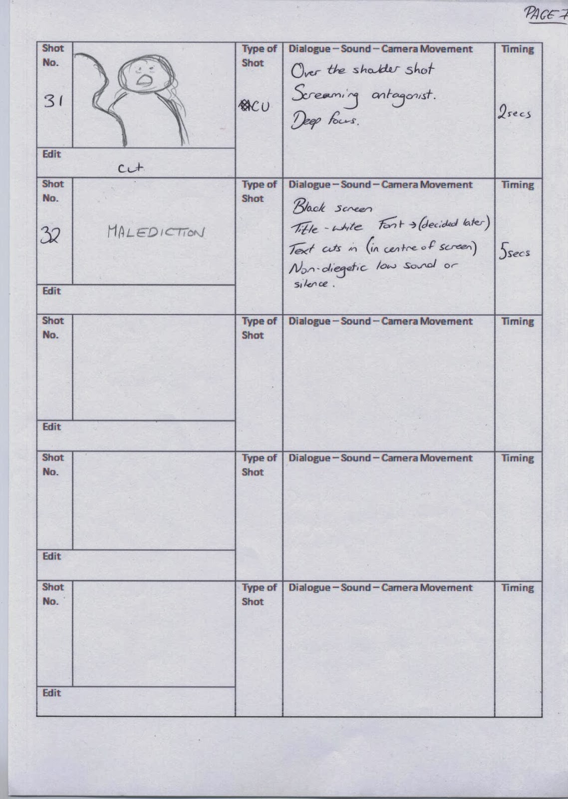
This is the storyboard we have each created in our group. To enlarge the image and read the information just click on each page.

Location Scouting and Test Shots // Pre-Production


When coming up with our idea for our film opening I realised straight away how the house next door to me is empty so I took some photos of it to show Wilhelmina and Indya, they both agreed it was perfect. After getting permission I went and took some test shots which include some shots which are from our storyboards and other extra ones which I thought looked good.

This location is definitely the most suitable to film in terms of logistics and representation. It is right next door to me so it is very easy to get all our equipment and props across and set up filming fairly quickly. As well as this we have been granted access for all of the 18th and 19th of February meaning we could enter the house whenever we wanted then making it easier when planning what time we are filming. This house is a rural, detached, large, empty house. All of those things together makes, in my opinion, a great location for a supernatural horror. The idea that whoever is in the house will be alone makes it even more typical of the genre and as it is in a rural area and makes the character seem even further away from other people.

From these tests shots I can see how our choice to use natural lighting works well. The composition of these shot are easy to see and they aren't too bright (therefore they don't seem artificial as they are not).

Monday, 10 February 2014

Moodboard: Explanation // Pre-Production


This is our mood board which we created for our big pitch. I felt we didn't get to properly explain this during our pitch so I've decided to create a separate post dedicated it to guide you through our ideas and how we will create a mood and portray the supernatural horror genre.

The main iconic prop we will use is a doll. The doll we will use is authentic and over 100 years old (it will be one of the dolls in the mood board.)  I believe this is a good prop as it creates a creepy element and gives the impression that wherever the doll is there must be someone else (the owner of the doll) nearby. As well as this, in terms of logistics, it is great as the doll(s) belong to Wilhelmina's Mum. Other props we have include a pen, old newspaper cut out, estate agent forms, a clipboard and a handbag. these are simply some props for the stock character so do not need to create an atmospheric mood. Although thinking about it those props do make the scene more authentic as people will be able to relate to the normal things being there which will then make the audience more scared as they could easily be in a similar situation the stock character is in.

The location is a house that is currently empty. This house is old and rather creepy as it is large and as I said before currently empty. This will make the opening very ominous as only Suzanne will be in the house with no one else there (or so she thinks). 

We will use natural lighting as we think artificial lighting will make the scene look fake and put together and we don't want to take away the creepy element by having random lights dotted in places. As well as this supernatural horrors are generally quite dark as they use natural lighting.

The two actors we will use are Wilhelmina and Indya (in the pictures above). We all came to agreement that they were best to take part as they are very reliable (since they are part of the team), they want to act and they both look the best for the part to create the right mood.

Indya and Wilhelmina acting will not in any way affect the amount of work they do to film the opening, we will film equally and split roles equally on the day so it is our opening and not just one person's.

Indya (Suzanne) will wear a smart, black dress to show how she is a professional woman who you would expect to be quite brave therefore meaning if there were creepy noises or a doll in the house this stock character is likely to check out the situation instead of running out of the house scared. This shows Suzanne subverts the archetypal role of women which is done quite a lot in supernatural horrors as female characters are generally quite curious. Wilhelmina (the antagonist) will wear a white dress with no shoes. This shows a good contrast to Suzanne and will make it clear who the antagonist is.

The weather is likely to be cloudy and we could even have rain. We are hoping for it to simply be cloudy to create a chilling atmosphere.

In the mood board above you can see some ideas of the typography we may use. It will be in white with a black background and will probably be quite a simple font or a creepy one (like the ones above). The font will be decided later.


Sunday, 9 February 2014

Target Audience Feedback On Idea // Pre-Production

Target Audience: Teenagers and Young Adults

After pitching our idea we soon realised we hadn't got any proper audience feedback from the audience we pitched to. Because of this it meant we each had to carry out our own audience research. I contacted several teenagers and young adults and these were their views overall:

Positives:
    - Good idea.
    - Can create something that's quite plausible and realistic .
    - There are lots of moments when you can get jumps in, which is good.
    - The curse idea is great, it suggests bad omens and maybe that the estate agent has done something to upset the antagonist.
    - The idea of having a young girl as the supernatural being is really effective because in horror stories children are always terrifying.
    - Good location as it's quite eerie and in the middle of no where so it's ordinary and makes people wonder if the situation would happen to them making it more realistic.
    - Good, interesting storyline (classic supernatural horror idea).
    - Estate agent is quite good as she's ordinary.

Negatives:
    - A bit predictable.
    - There are no unexpected plot twists so the ending may be obvious.
    - Teenagers may struggle to relate to the estate agent because she's professional and older.

Developments:
    - Instead of having an estate agent you could have a character that's very similar to the target audience, but then again it is difficult to place a character in an empty house without it being somehow related to the business side of things.
    - Maybe it could have one feature that makes it stand out from the other horror stories so people would really want to go and see it at the cinema.
    - You could advertise a back story for the antagonist, or the estate agent could be related to her in some way or linked to her death.

From this feedback I can see we have quite a few good ideas but some negatives and possible developments.

As we are doing a supernatural horror and want to follow the codes and conventions of it we are happy for the storyline to seem a little predictable as it means it's more likely for teenagers and young adults to like it as it's not completely different to normal supernatural horrors. I understand how teenagers may not be able to relate so well to the estate agent however young adults are likely to and as one member of our target audience said it would be hard to place a person in an empty house without it being related to something to do with business.

I found the developments about having a unique feature and advertising things about the antagonist interesting. Unfortunately, for this project we are not going into advertise our film so we can't develop it in that way. We have, however, decided to include some writing with a bit of a back story at the start so people are introduced to the story and given some context. We also hope that the name 'Malediction' would entice people to see it enough as it's such an unusual word and people will want to know what it means and how it relates to the story.

The Big Pitch // Pre-Production


This is the video of Wilhelmina, Indya and I pitching our ideas to the class. Apologies for the slides taking a long time to change but there was nothing we could do to fix it.

Saturday, 8 February 2014

The Big Pitch - Our Ideas (PowerPoint) // Pre-Production


The Big Pitch - Our Ideas from katyfilmmaker

On Friday the 7th of February Wilhelmina, Indya and I pitched our ideas for our film to the class. We used this PowerPoint which includes the genre we chose, target audience, film name, ideas for the whole and opening of film, representation and mood board.

Monday, 3 February 2014

Supernatural Horror Openings - The Woman In Black (Typography) // Research

In this clip of the film opening no titles are shown therefore I cannot comment on any typography. From this I can either infer that the titles were before the clip and wasn't included or came after the opening clip making the opening clip more of a focus to set up the narrative instead of the titles.

Supernatural Horror Openings - The Woman In Black (Genre Iconography & Themes) // Research

Genre Iconography


A creepy doll
The props used follow the typical horror iconography very well. Items that people can relate to, but made a lot more creepy are generally used. For example, lots of the female audience will relate to playing with dolls when they were younger, and in this opening dolls are shown, but they are made to be very creepy. In addition to this a creepy rocking horse and other old fashioned toys can be seen in a long shot of the girls in the room.

As well as this the location is pretty iconic as the room and décor of the room is made to be old fashioned and spine-chilling. Throughout the opening some long shots and some close ups are shown. This gives the audience a chance to take in the location and at the same time focus on specific elements of it. In addition to this in this freeze frame you can see how there are 3 windows which matches the amount of girls there are. From a glance these windows appear to have the tops of trees as their view. This tells the audience how the girls are not on the bottom floor of the house and if they jumped out of the window they would get hurt. Putting characters (even stock characters) in tricky situations like this is typical of the horror genre as almost every time it means characters will get killed off.
A long shot showing the location


This film is likely to be set in the Edwardian era and the costumes strongly reflect this as the girls are wearing long dresses. This old fashioned style again as I said before can be very iconic for horror films as old fashioned settings and costumes are very easy to put a creepy twist on and make people feel uneasy.

However, one of the main iconic aspects of supernatural horror in this opening is the incidental music. This music fades in at the start of the opening and stays there throughout. It typically builds towards the climax of the opening when the girls jump out of the window and then fades out as the diegetic scream is heard. The music is very effective and iconic as it is one of the main things that create atmosphere. If you try watching this opening with One Direction playing in the background then the opening will not have the same creepy effect (unless One Direction creeps you out).

Themes


The theme in this opening is definitely the unknown, unfolding terror. I know this simply because continuity editing shows clearly the girls staring at the unknown being and then following it's orders. The unknown being unfolds a little with the over the shoulder shot at the end but there is still a lot more time for the being to unfold and reveal itself throughout the rest of the film.

Sunday, 2 February 2014

Supernatural Horror Openings - The Woman In Black (Characters & Situations) // Research

Characters


Antagonist in the left foreground
Only one key character appears to be shown in this opening and this is shown right at the end where there is an over the shoulder shot of someone wearing a veil. This is likely to be the antagonist as it is where the being who made the children jump out of the window appeared to be earlier in the shot when the children looked over at someone. In this shot very good cinematography is used as the antagonist is only shown a little on the right hand side and if I'm honest at first after watching this film twice I didn't even notice the antagonist in the right foreground. This is good because it's very subtle, which makes it more creepy, meaning that if people notice her they will be worried about who that woman is and why she did that to the children. While if others don't notice her in the foreground they are left to their own imagination to wonder who made the children do that and why.

Some stock characters are also shown (the 3 children). These stock characters are young, female children which is quite typical as they are very vulnerable to supernatural beings. They are first shown at 0:16 in a long shot. These actresses are not recognisable (well known) showing how the star system wasn't used as these actresses are likely to be able to behave how they want when not filming as they are not under pressure to be perceived in a certain way in the media. It is highly unlikely for the star system to be used anyway as it ended in the 1960s and was used in Hollywood (this is a British Independent film). As well as this diegetic dialogue is heard at the end of the opening revealing another stock character of the mother or mother figure to these children.

Situations

This opening is quite a typical stock situation. There's no better way to start off a supernatural horror than killing off some stock characters. The fact that these girls kill themselves under the antagonists order suggests that similar events may occur later in the film. The audience can also conclude that the antagonist has something against children.

Saturday, 1 February 2014

Supernatural Horror Openings - The Woman In Black (Background Information & Narrative) // Research


Background Information:

The Woman In Black (2012)
Director: James Watkins
Studio: Cross Creek Productions, Hammer Film Productions, Exclusive Media Group
Success?
 -Box Office: $127,730,736
 -Awards:
    -Empire Awards, UK , Won, Best Horror (2013)
    -Academy of Science Fiction, Fantasy & Horror Films, USA, Nominated, Best Horror/Thriller Film (2013)
       and more...

Narrative:

The scene opens with a fade in (from a black screen) of a medium close up of a cup of tea being poured. No real tea (or any liquid) is poured into the cup revealing to the audience that it is likely for children to be playing with a tea set as it would be too dangerous for them to have hot liquids. Various other close ups and long shots are shown which reveal 3 little girls playing in a large room with old fashioned furniture and toys. At 0:36 a long shot of the girls are shown and during this shot they turn towards the camera looking at it as if someone is looking at them or saying something to them (this is likely to be the antagonist). These girls then look at the window, and walk up towards it crushing the toys with their feet in the way. The scene ends with them jumping out the window and a woman screaming saying, 'aaaah, my babies'.

Supernatural Horror Openings - The Omen (Typography) // Research

The typography is pretty typical as at first an ident appears. This is followed by the titles that fade in at 0:12 in a white, simple font. By 0:20 this font becomes larger and bolder emphasising it more and making it seem more powerful and intimidating which can be a good mood to give off for a horror opening.
Smaller titles
Larger titles
 This font represents the genre as it is simple and understated meaning the audiences attention is more on what could happen in the film instead of how great the titles look.

Supernatural Horror Openings - The Omen (Genre Iconography & Themes) // Research

Genre Iconography

No props, costume or a proper location can be seen in this opening meaning there is nothing in those areas to comment on. However, in the horror genre a lot of the time less is more and it is enough with creepy, incidental music, titles, and a dark screen with a moody picture to portray an iconic opening as it leaves a lot of things to the audience's interpretation. This makes the audience imagine the worse things possible and work themselves up for what could happen during the film, therefore making it easier for the film to scare them.

The sound is particularly iconic of the horror genre as it reminds the audience of quite old, gothic horror themes and church, SATB choir music which can become quite creepy with the right song.

As well as this the lighting is quite iconic as back lighting is used which silhouettes the character and makes it so the audience cannot see any of his or hers features (making the character an unknown, unidentifiable being).


Titles and image given equal importance
The framing of the shot could also be said to be iconic as the titles are shown dominating the left side of the screen and the image of the man is on the right side. This gives the two things almost equal importance and when film openings of horror movies are done in a simple way like this the titles and image (or thing in the background) usually have equal importance as the director will want the audience to pay attention to the scene but also not ignore the titles.

Themes of the Genre

I would assume the theme of this film is the unknown, unfolding terror however I cannot be sure as not much is given away in the opening. I think it is probably this theme as in the opening not much is shown which therefore makes whatever the antagonist will be unknown. This antagonist is likely to unfold throughout.

Supernatural Horror Openings - The Omen (Characters & Situations) // Research


Characters

Only one character is shown in this opening and it is hard to tell whether this character is a key character or just a stock character as simply a silhouette of this person is shown and they do not move at all.

Situation

A man with a confusing shadow
In this opening no narrative structures are given away and only an ident, some titles and the image of a man with a shadow is shown. Therefore this doesn't really give the audience a situation but definitely establishes a mood and makes the audience wonder who this character is and why he shadow is a religious cross when he clearly isn't the exact shape of a religious cross. This, in a broad way, is a typical situation of horror films as it is confusing the audience as it is showing them one thing but also something else that contradicts the first thing.

Supernatural Horror Openings - The Omen (Background Information & Narrative) // Research


Background Information:

The Omen (1976)
Director: Richard Donner
Distributed by 20th Century Fox
Success?
 -Box Office: $60,922,980
 -Awards:
    -Academy Awards, USA, Won, Best Music, Original Score (1977)
    -Academy of Science Fiction, Fantasy & Horror Films, USA, Nominated, Best Horror Film (1977)
        and more...

Narrative:

The 20th Century Fox ident fades in at the start and stays for almost 9 seconds before fading out. After a couple seconds of silence this is followed by incidental music coming in and titles appearing. By 0:26 an image of a person standing with a shadow of the cross is in the background on the left. The whole opening scene consists of the incidental music continuing, the titles playing and the image of the person still there.

Supernatural Horror Openings - The Strangers (Typography) // Research

 
The typography represents the genre, horror, in quite a subtle but effective way. The title is shown on a black screen in the background which is a typical convention of horror as it makes the composition look more unnerving and the dark is a genre icon that makes people think of creepy, unknown beings. The font used is effective as it is all in capitals, in a clear font that is quite small and in the colour orange. The fact that it is small isn't a bad thing and if anything it gives the impression that the strangers could be people always watching you from far away. In addition to this orange can be quite a bright, un natural colour and it isn't very relaxing. For horror films the typography shouldn't be relaxing and comforting and this title isn't which shows it follows the horror codes well.
 
This typography fades in and out which is quite typical and effective as it leaves the audience with a pitch black screen for a while letting them fill their minds with scary images related to the words  'the strangers'.

Supernatural Horror Openings - The Strangers (Genre Iconography & Themes) // Research

Blood splattered on the wall
Genre Iconography

There are a couple of icons in this opening which makes the film's genre easy to identify. For mis en scene one prop being used is the usual murder weapon (in this case a bloody knife). From this the audience can recognise that this was likely to be used by the antagonist towards the protagonist or a stock character. As well as this a long shot of a gun is shown, this intensifies the situation that has happened as it makes the audience wonder whether it was used as well. In addition to this some blood is shown that has been splattered on the wall. This is quite a typical icon as with horror, blood is almost definitely always involved. The fact that the blood is splattered gives the impression the antagonist has had pleasure in killing someone and has done it in a messy, violent way.


Suburban house in the day
More rural house at night


The location is also quite a typical code for the horror genre. During the introduction many long shots of houses are shown that fade in and out from a black screen and are panning along as if the camera is in a car driving. As the clips go along the setting gets darker and appears to become more remote and rural and out of the busier suburban area. It is likely the person driving is the protagonist(s) as near the start it is mentioned how after the couple got engaged they went to a summer house, which is likely to be in a rural area. The scene getting darker is a usual convention as generally in horror films the bad situations happen in the dark as it is more mysterious and the idea of the unknown can really creep out the audience. It also gives the impression that the couple have driven a long way to get to the summer house (as it was the day but now it's night time) meaning that if they are in trouble it will take a longer time for help to come for them.

There is no iconic costume in this opening as only some stock characters are shown that aren't that relevant to the film.

The sound is quite iconic and typical of the genre. Incidental, non-diegetic music is used throughout which gives off a tense atmosphere and already allows the audience to predict and anticipate something bad happening. A non-diegetic, voice over of a low, serious voice is also used and as it is low and serious it makes what he is saying more believable. Turning information that is likely to be made up for the horror film into believable information is an iconic thing to do and adds a good element to the film as the audience become immersed in it. In addition to this the usual 911 call recording is played. This is used in quite a few horror films and is iconic as it is a thing that sometimes regular people have to do so it makes them connect with the situation more and become more worried for the person in trouble on the 911 call.

Themes of the Genre

Just from the opening of the film you can't exactly tell what the theme of it will be. However, if I was to infer myself then I would say it is likely to be a hybrid of themes. These themes being; unknown, unfolding terror, overwhelming gore explosion and the serial kill fest. I believe that one of the themes is unknown, unfolding terror as it is possible that the protagonist who is harassed throughout the movie will not exactly know who is harassing her and will become more scared as the unknown unfolds itself. In addition to this as I've said before blood splattered on the walls is shown in this opening which makes me immediately connect it to the overwhelming gore explosion theme as later on in the film it's likely the audience will be shown the killing that has taken place. This brings me to my final theme, the serial kill fest. I'm not so sure about this film as I don't know whether a mass of people are killed however it is evident that at least one person is killed and someone else is being harassed which makes me think it could be possible that others are involved.