
The Title of the Film
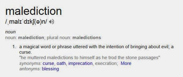 |
| the definition of malediction |
Setting/Location
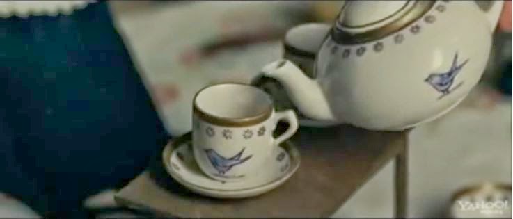 |
| The first shot of The Woman In Black (not an establishing shot) |
Costumes and Props
We only needed to plan two costumes for our opening, the antagonist's and Suzanne Moor's. In both cases we tried to follow the conventions as best as we can while also making our film individual. Suzanne is an estate agent (she can be seen in frame 4, 6, 7 and 8 in the picture above) so we believed she should be wearing formal clothes (a black dress, black high heels, etc). In retrospect I can see that if anything her costume alone challenges a lot of real media products as generally the stock character will be a regular person in casual clothes as it allows the audience to relate to them. For example in Paranormal Activity the characters wear casual clothes throughout. In this case, for our opening, we have put the regular person in professional clothes which we see may relate to less people but will for people who have jobs.
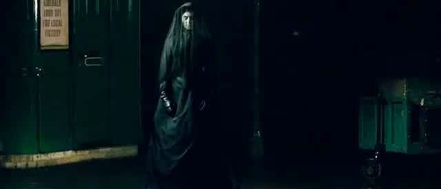 |
| The Woman In Black wearing a traditional dress |
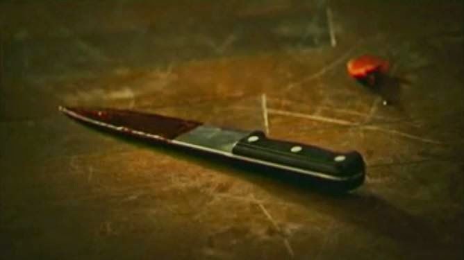 |
| A bloody knife in The Strangers |
The props we used were a doll, a newspaper cut out and a clipboard with estate agent documents on. The doll can be seen in frame 4, 5 and 6 in the picture above. I definitely think the doll follows the codes and conventions as other media products such as The Woman In Black which uses dolls as a very dominant prop throughout. We used the other props to make our product seem more realistic and believable. This is done throughout other openings for example in The Strangers a knife is shown with blood on it and there is blood on the wall which enforces the idea that the media product is real.
Camerawork & Editing
Throughout our opening we have used many shots that are used in real media products. The usual ones like medium shots, close ups and long shots are used. But as well as this the shots we used that I think define supernatural horrors are over-the-shoulder shots (as seen in frame 7 and 8 in the picture above), and shots with slight handheld movement to give the impression that something unknown is in/near the shot. These shots are both used in many film openings such as The Strangers.
Title Font and Style (Typography)
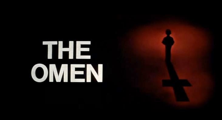 The titles of our film can be seen in frame 1, 2 and 9 shown on the picture above. The text we used is all white font we produced in LiveType. By using a simple font we have used the conventions of real media products as in various openings like The Omen and The Strangers. The Omen uses white simple text on a black background like ours. The Strangers also has simple typography used for its title and it is revealed at the end of the opening by fading in which is very similar to what ours do. I can see why this is a convention in supernatural film openings as it is very effective using the idea of 'less is more' and the fact that a crazy, busy font would distract from the atmosphere of the opening that is created with incidental music.
A conventional film opening uses titles. These usually include the production company, actors names, and who produced and directed the film. These conventions have been followed in our opening however we have slightly subverted it as we have not put in the person who produced it. Although, we do include a production company so I believe this is enough.
Story & How The Opening Sets It Up
Our story is set up in a very conventional way of a lot of supernatural horror movies. We start with writing that fades in and out on a black screen (as shown in frame 1 above) explaining an event in the past and how the causes of death are 'unknown'. This is then followed by shots of the house (exterior and then interior). One shot that particularly sets up our story is the newspaper cutting that's shown that relates to the deaths mentioned at the start. In the same shot estate agent documents are shown which allows the audience to see the house is being sold and possibly infer that someone is investing time looking into the past of the house and trying to sell it regardless of it's past. A stock character is then shown and drawn to a room on the other side of the house as the prop of a doll appeared in the distance. A diegetic laugh leads this character into a room at the end of the house and there she finds the antagonist on the other side of the room who quickly turns towards her and then after a black screen, is very close to her and screams in her face. This gives the chance for the audience to see the antagonist which challenges forms and conventions of supernatural horrors in many ways as usually only a small amount of the antagonist would be shown. For example in The Woman In Black at the end the shoulder of the antagonist is shown which works very well as the audience is more bothered by the unknown. Regardless of that I think it still works well to for our opening to show the antagonist as there is still information the audience may wish to find out about the being including where she is meant to be and why she's there, etc.
 |
| Antagonist subtly shown in the right foreground |
Genre & How The Opening Suggests It
The genre our group chose was a supernatural horror. The opening suggests this greatly with the combination of slow moving shots, incidental music and a stock character which is led into a dangerous situation. An element of this happens in a lot of supernatural horrors that I have seen.
How Characters Are Introduced
 |
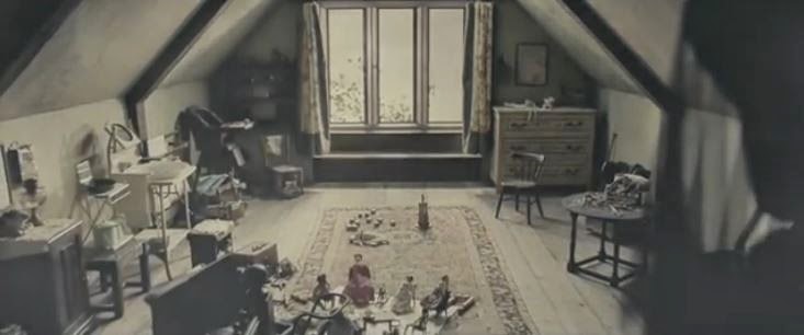
| Stock characters in the Woman In Black |
Conventionally in any opening the main protagonist or a stock character (or many stock characters) is (are) shown so that the audience is introduced to someone or a situation that is important in the film. For example, from my research I found that the opening of the film Hot Fuzz is entirely dedicated to introducing the protagonist. We have subverted this partially by not introducing the audience to the protagonist. Although, as far as the audience is aware the stock character introduced could easily be mistaken for the protagonist. As well as this as I mentioned before we introduce the antagonist as well who is an important character so we are following the conventions of real media products to have important people in the opening.
Special Effects
No special effects are used in our opening. We do, however use filters (colour correctors) throughout. For the outside shots we put a darker filter with very little saturation while for the shots inside we made brighter/lighter and added a slightly blue filter. From my research I found how slight blue filters were used a lot in openings like in The Woman In Black so I personally believe it was the best choice.
In film openings they will conventionally use some kind of filter to portray a mood. Special effects are used depending on the genre of the film. For example an adventure film will probably use special effects.
No comments:
Post a Comment