Saturday, 29 March 2014
Malediction - Final Cut
Continuing Editing (Improvements)
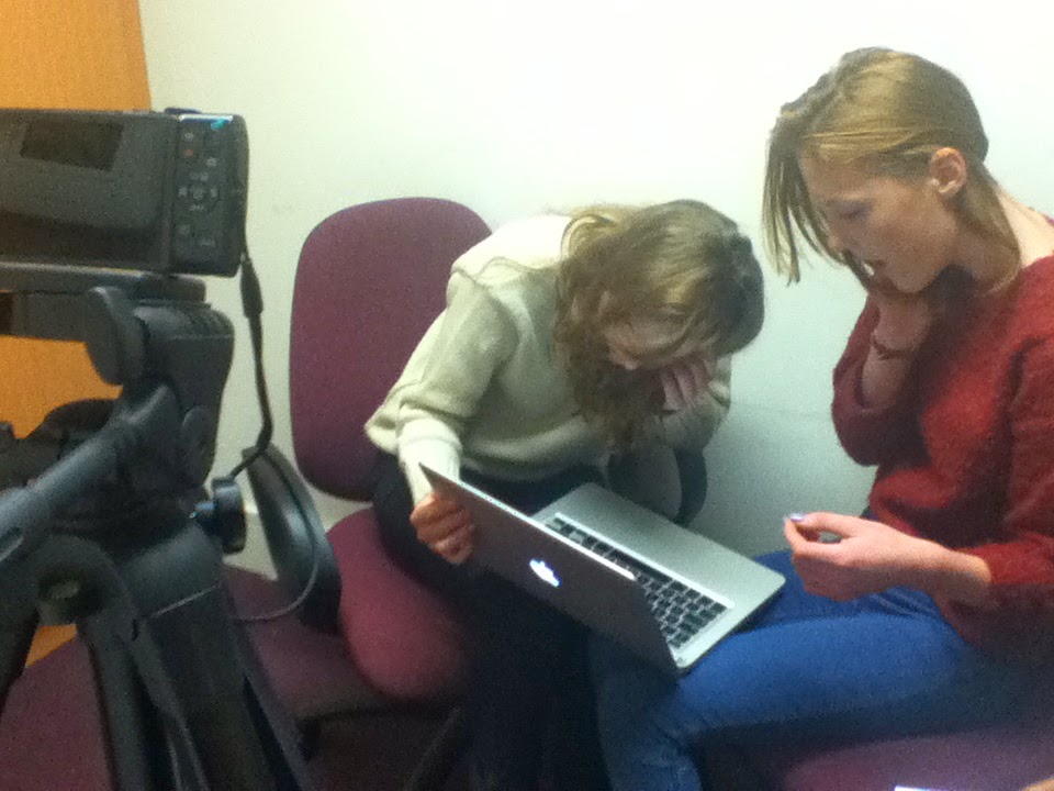
The next day (Thursday the 27th of March) I was in school so I got to work with Wilhelmina and Indya on the rest of the improvements.
We acted on the feedback about filters by making the shots outside the house darker and the ones inside lighter.
As well as this we improved some of our titles.
'HIDDEN PICTURES PRESENTS' was one of the ones we thought needed most improvement as the white 'H' cannot be seen very easily because of the sky which is also white. To improve this we added more of a black shadow effect and outline which improves this greatly compared to how it was.
We have also repositioned 'A Paranormal Production' more to the right so the text does not go across the side of the door and we have moved 'Directed by Katy Jackson' to the right a bit so it does not touch the character Suzanne.
Near the end of the lesson we exported the final version of our film opening!
We acted on the feedback about filters by making the shots outside the house darker and the ones inside lighter.
As well as this we improved some of our titles.
 |
| Editing some of the titles |
We have also repositioned 'A Paranormal Production' more to the right so the text does not go across the side of the door and we have moved 'Directed by Katy Jackson' to the right a bit so it does not touch the character Suzanne.
Near the end of the lesson we exported the final version of our film opening!
I was ill!
Unfortunately on Wednesday the 26th of March I didn't come into school as I felt very ill with a bad cough and cold. This was incredibly frustrating for me especially since I have also been to Manchester recently so I feel as though my contribution to the group is lacking.
When I was gone Wilhelmina and Indya made some of the improvements that were given to us previously. The improvements they made included building up the sound more at the end by adding another soundtrack that subtly makes the sound feel thicker and as though you're building up to more of a climax in the opening.
As well as this they asked our teacher and another member of staff for some feedback.
The feedback they got was as follows:
- Cut down the shot of the antagonist screaming
- Make some shots shorter because at times the camera jolts
- Slow down the establishing shots at the start
Indya and Wilhelmina did all these things. They mentioned to me when I got back the next day how at 0:57 the sound suddenly reduces in volume quite a bit. None of us our sure why it does that or how to fix it so we will just have to leave it as how it is.
Friday, 28 March 2014
Malediction 3rd Rough Cut - (Further Audience Feedback)
As I mentioned in my last post one of the people we last interviewed (James) has a sister who is at Nottingham Trent University studying Design for Film and Television. When James told us about her we thought it would be an excellent opportunity to get feedback from someone who was studying at University and still within our target audience. When she came back from University for the weekend James showed her our 3rd rough cut.
The improvements were as follows:
The improvements were as follows:
- The shots outside the house should have a darker filter.
- The shots inside the house should have a lighter filter.
- The diegetic sound of the door opening should be made slightly louder.
- When Suzanne is approaching the room where the antagonist is the music should build up more to enhance tension.
She did however say our film opening was very good for an AS Level piece of work so we were pretty happy with that and her constructive comments.
Monday, 24 March 2014
Malediction 3rd Rough Cut - (Audience Feedback)
The other day we collected audience feedback for the 3rd rough cut from different people (who are still our target audience).
From this video you can see no improvements were given to be made. Luckily for us James (one of the people in this video) has a sister who does work involving film and she will give us feedback soon which should definitely include some improvements.
Wilhelmina edited this video.
Saturday, 22 March 2014
Malediction - 3rd Rough Cut
This is the 3rd rough cut that Wilhelmina and Indya produced on the Thursday lesson when I was away. They used the improvements given in the audience feedback.
These included:
- incidental music building up in volume at the end
- the diegetic sounds (door and laughter) not being too loud
and more.
As well as this Wilhelmina told me they asked someone in our class and they suggested to have 'Wilhelmina Denness Indya Clayton' instead of 'Wilhelmina Denness & Indya Clayton' as movie openings don't tend to include an '&'.
In addition to this Indya and Wilhelmina added a more noticeable dark filter which I agree with as it makes the opening seem more eerie.
Friday, 21 March 2014
Been In Manchester!
From the 18th of March to the 20th I was away on a Geography field trip in Manchester. This meant Wilhelmina and Indya had some time to carry on with our opening without me. We had already prepared for this as we discussed what they would get done when I was away and now that I'm back I'll take a bit more of a lead to make up for being away.
When I was gone they did more editing and have exported Malediction - the 3rd Rough Cut. This will be revealed in my next post!
When I was gone they did more editing and have exported Malediction - the 3rd Rough Cut. This will be revealed in my next post!
Monday, 17 March 2014
Malediction - 2nd Rough Cut (Audience Feedback)
 In our last Thursday lesson we randomly selected 4 boys and 4 girls of people who were within our target audience. They watched the 2nd rough cut of our opening for the first time, we asked them questions and they answered.
 Wilhelmina edited together the video shown above which shows all the questions and answers.


Malediction - 2nd Rough Cut
We decided to show our rough cut to our teacher as she had not yet seen any of it. She liked what we had done but also gave some initial improvements to the editing to make it seem more professional. These improvements were as follows;
- fade in and out more on the diegetic laughter sound
- make the clip a bit longer near the end when the antagonist is shown and turns around
- make the section where there is just a black screen at the end a bit shorter
Sunday, 16 March 2014
Malediction - 1st Rough Cut
After all of our editing sessions this is the first rough cut we produced! We edited to a standard we were happy with but didn't look too much into tiny details that we weren't so sure about as we figured this was good enough for a rough cut and the fact that there is a lot of room for improvement is a good thing.
Saturday, 15 March 2014
Exporting Difficulties
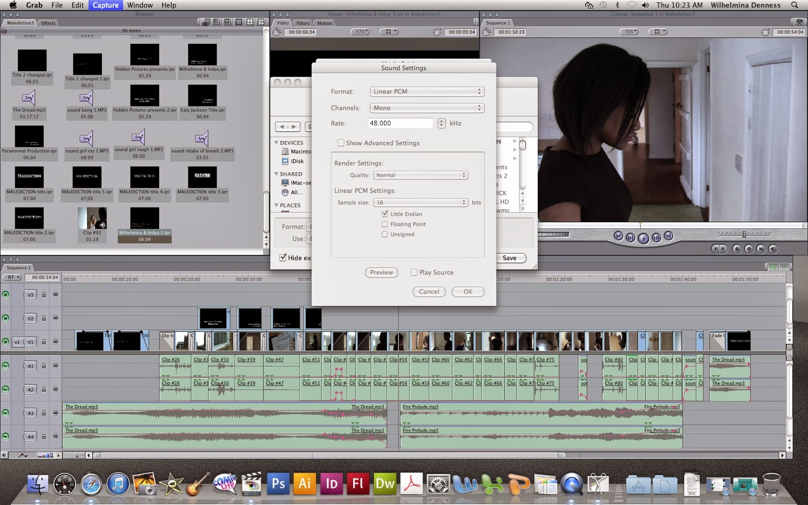 We have had very little problems when editing our video however when we came to export it, it automatically exported it as an .mov file which we didn't see as a problem until we realised we couldn't play this file format in our own homes and we couldn't upload it to YouTube.
Because of this we had to find a way to export it into a file that was compatible with our computers/laptops at home so that we could upload it to YouTube.
These pictures show how we managed to get it to export. We continued to do this for the rest of our videos.


'Malediction' Title Feedback

From these results I can see that number 1 and 4 are the least popular and therefore will definitely not be used. Number 2 is the most popular followed by number 3.
For our rough cut we have used number 3 which we all easily prefer and is the 2nd most popular from our results. We take into account the fact that number 2 is the most popular but we all think there's a bit too much going on and it's better for it to be simple. The opening is set in an old house with themes of old, possibly Victorian things (e.g the doll, the antagonist in the simple white dress) so we think the typography should reflect this.

Friday, 14 March 2014
Conventional Titles/Credits - do our titles/credits follow the conventions?
For our titles/credits to be successful we want them to at least broadly follow the conventions of horror film openings as it will make our opening seem more professional and realistic.
I stumbled across the film Dolls when looking at various title sequences for movies. Dolls is a 1987 horror film set in the English countryside where some people stop by a mansion during a storm and find haunted dolls in the house. This has some aspects similar to our storyline (the English countryside, the doll in the house) so I realised the typography and what it says is likely to be similar or follow a similar structure.
It starts with 'Empire Pictures Presents' which fades in and out of the screen. This is pretty similar to ours and from looking at other horror openings I can see quite a few films go for this as a starting point.
It then goes on to show the production company (or in this case who produced it) which ours also does.
After this the main title is shown. By looking at other horror movie openings I have found that some do this where the opening is simply a lot of credits, while others that have action/characters in their opening tend to put the title of the film at the end like we do.
This opening then goes into more detail (e.g who stars in the film, who does the doll effects, etc.) Ours shows two people who star in it by just writing their names but does not go into anymore detail. I think this suits our opening and follows the conventions for openings with action in because as I said before the emphasis is on the action and not the titles so much.
Wednesday, 12 March 2014
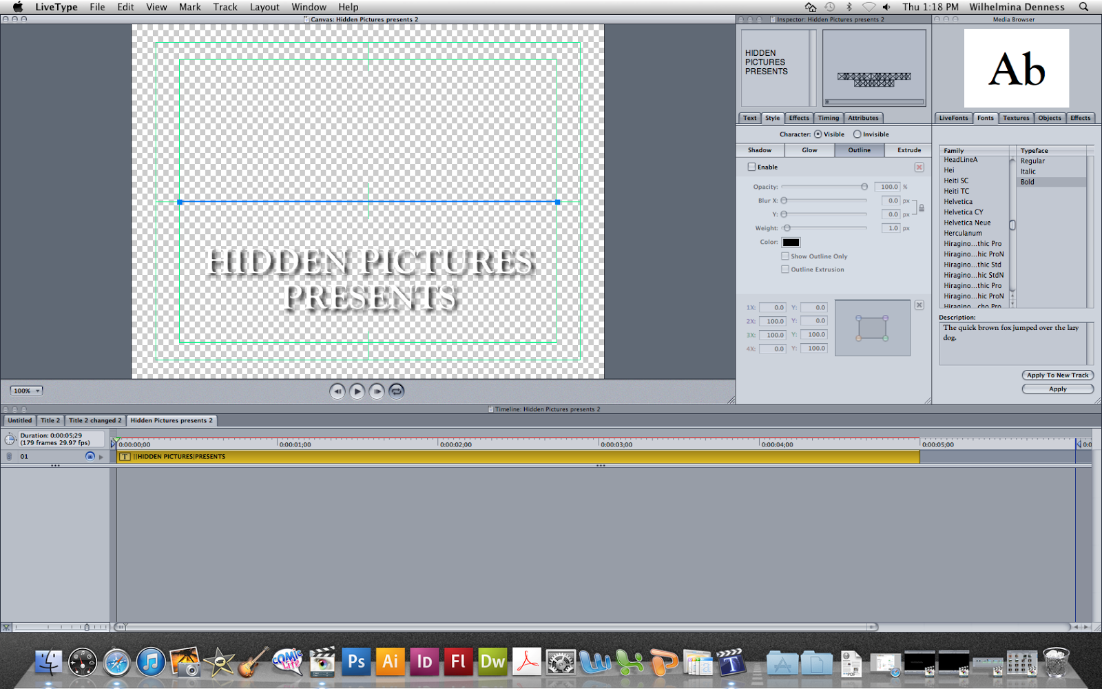
So, What Do Our Titles/Credits Actually Say?
Before the first version of our rough cut is revealed I thought I'd give you a taster of what it will contain. The titles/text shown during it (in this order) are as follows...
On the 11th February 1972 a family of four were found dead in their home.
The causes of death were unknown.
HIDDEN PICTURES PRESENTS
A Paranormal Production
Wilhelmina Denness & Indya Clayton
Directed by Katy Jackson
On the 11th February 1972 a family of four were found dead in their home.
The causes of death were unknown.
HIDDEN PICTURES PRESENTS
A Paranormal Production
Wilhelmina Denness & Indya Clayton
Directed by Katy Jackson
Editing The Rough Cut 7th Session // Post-Production
 |
| The Paranormal Production team has been reunited! |
Sunday, 9 March 2014
Sound // Post-Production
Through our research we soon realised how sound (mainly incidental music) would be vital to creating the right atmosphere in our film opening.
A couple of weeks ago someone suggested to us a website where you can download royalty free music this person has created themselves for free! The website is http://incompetech.com/ We then had a listen and heard how the songs were actually pretty good! Wilhelmina then found the following songs and suggested them to Indya and I.
The House Of Leaves
This incidental music is really quite good to have as a soundtrack for the opening of a movie as the music starts quietly and then gradually builds up to create tension and worry to the audience. The slightly high pitched melody throughout sounds a bit like a children's wind up toy box sound which links well to the doll in our opening. All things considered at first we thought this would be quite a good piece to use until we heard other pieces (some of the ones below) which we thought were more suitable in creating the correcting atmosphere.
The Dread
I really like this piece as incidental music for two main reasons. There is a low, bass sound throughout that is often used in supernatural horror movies as it is if any normal background sound has been intensified and put into a much lower pitch to make the audience feel on edge and as if something bad may happen. The other thing I like is the high pitched sound that is put over the top of the bass. This sound tends to change a bit more making the piece feel uneasy which helps create an ominous atmosphere for a film opening. We decided to use this piece for the start and end of our film as we believed it suited our movie opening best as it wasn't really dramatic and relied more on the idea of 'less is more' as with not many sounds going on the audience may feel less safe and scared of seeing the antagonist.
Anxiety
We thought this piece was a little similar to 'The Dread' because of the high pitched noise that tends to fluctuate about a bit. Therefore it was a condendor to be played at the start of the piece. However, hearing it and comparing it to 'The Dread' we felt it didn't have enough of a texture and lacked the ability to really make the audience feel nervous and on edge so we did not use it.
Fire Prelude
When Wilhelmina found this she instantly liked it as she associated the initially banging/knocking noise with someone actually banging or knocking. On first hearing Indya and I agreed as it put us on edge and made us feel as though someone or something was making a continuous sound to attract attention and lure an innocent stock character into a place of danger. This fitted perfectly with our opening as Indya (Suzanne Moors) is drawn to the room where the antagonist is because of a doll on the floor. Therefore we decided to introduce the music when the doll appears.
Overall in the end we decided to use 'The Dread' for the start of our opening and then later when the doll is introduced we will use 'Fire Prelude'. We have also used 'The Dread' for the end when the title ('Malediction') appears.
Editing The Rough Cut 6th Session // Post-Production


Thursday, 6 March 2014
Editing The Rough Cut 5th Session // Post-Production
 In today's lesson I was completely on my own! Wilhelmina & Indya were both away on various trips. Before hand Wilhelmina gave me the password for her account so I could access what we had been editing.
  I just continued off from where we got to and managed to get to the end of the clips and edited them together roughly. I also added one sound effect we had recorded during our day of filming. This sound effect was of Wilhelmina laughing and I put it in after Indya is holding and looking at the doll. As well as this I had to try and time the final clips well as before and after the antagonist screams there needs to be the right amount of time so that atmosphere builds but the audience doesn't get bored. In addition to this I added in another sound effect of an intake of breath that we recorded during filming.
As well as this I went on LiveType and came up with a couple of ideas for typography and saved them all in the Malediction folder so that when Indya and Wilhelmina are back we can get target audience feedback and then decide as a group which font we will go for.
 Since I have spent two hours editing alone once Wilhelmina and Indya are back we will go over what I've done and then make sure everyone in the group agrees on how the rough cut looks and we will make any changes if necessary.
Right at the end of the lesson I remembered how I'd forgotten to put any colour filters on yet so I will need to do that next lesson (tomorrow).
Monday, 3 March 2014
Editing The Rough Cut 4th Session // Post-Production
Today afterschool Wilhelmina, Indya and I headed to the media room to continue editing. We spent about an hour and 40 minutes editing and made so much progress!
At first we encountered a problem as when we opened our Final Cut Pro file the timeline and the viewer weren't appearing. We spent a couple minutes trying different things to allow them to appear but didn't have any success as where you would normally open them up the text was 'greyed out'. Wilhelmina took her initiative and looked in our Malediction folder and found a back-up file that automatically saved during our last session. We were all so relieved! As it had automatically saved during our last session it meant we had lost a little bit of our work we did near the end of the lesson but that didn't matter too much as we could quickly re-do it.
During this session we edited right up until Suzanne (Indya) is about to start walking towards the final door where she finds the antagonist. We also noticed how much the incidental music creates atmosphere and without it the video seems a little silly and unbelievable. Because of this we have kept our incidental music in a little longer than planned and we only have a second or so without music before the next piece of music begins. We have also muted the videos so you can not hear any background noise as the background noise is usually quite a harsh loud sound that makes the video seem less professional.
This editing session was really important as on Wednesday we have a Digging Deeper Day so will be missing our double lesson and on Thursday Wilhelmina goes to Barcelona on an art trip for a few days so Indya and I won't be able to consult her when editing. In addition to this Indya is away on a day trip on Thursday so I will have to edit on my own! This shouldn't be a problem as I can follow the storyboard and just do what I think is best. In addition to this it is only a rough cut so improvements can easily be made in the future.
Editing The Rough Cut 2nd & 3rd Session // Post-Production

Saturday, 1 March 2014
Titles // Post-Production
This week we have also been creating some of the typography on Live Type for our opening. We have been doing this in chronological order as we have come across the typography we needed. We are trying to follow the storyboard as best as we can but are finding some shots don't work how we thought they would and we've needed to sometimes use different extra shots we did with the typography on them as we think they're more effective.
In this picture you can see some of the different fonts we looked at in particular. The fonts are as follows; Goudy Old Style, Calibri Light and Viner Hand ITC. In the end we decided to go for Goudy Old Style as we believed it represented our genre, supernatural horror, the most as it was simple but had a slightly old, more formal effect to it which will make the opening seem as if it has elements of the past in it (which it does as the antagonist is from the past). This choice was backed up from my research as a lot of the titles I had seen were ultimately very simple with the main intention of the audience being able to read it. The idea that the events in the opening or even the music alone is enough to make the opening effective and give off the right atmosphere instead of having creepy typography.
We felt Calibri Light was too boring and regular looking and Viner Hand ITC was a bit over the top and less subtle which is an element we wanted in our typography.
 In conclusion we have gone with Goudy Old Style which in our opening will be white and will be written as it is below and sometimes all in capitals (e.g HIDDEN PICTURES PRESENTS). We think this typography will give the audience the best reading for the reasons I mentioned before. At the moment we have decided to have the typography fade in and out on the screen and will do it like that for our rough cut.
 |
| Trying out different fonts |
We felt Calibri Light was too boring and regular looking and Viner Hand ITC was a bit over the top and less subtle which is an element we wanted in our typography.
In conclusion we have gone with Goudy Old Style which in our opening will be white and will be written as it is below and sometimes all in capitals (e.g HIDDEN PICTURES PRESENTS). We think this typography will give the audience the best reading for the reasons I mentioned before. At the moment we have decided to have the typography fade in and out on the screen and will do it like that for our rough cut.
Subscribe to:
Comments (Atom)