This week we have also been creating some of the typography on Live Type for our opening. We have been doing this in chronological order as we have come across the typography we needed. We are trying to follow the storyboard as best as we can but are finding some shots don't work how we thought they would and we've needed to sometimes use different extra shots we did with the typography on them as we think they're more effective.
 |
| Trying out different fonts |
In this picture you can see some of the different fonts we looked at in particular. The fonts are as follows; Goudy Old Style, Calibri Light and Viner Hand ITC. In the end we decided to go for Goudy Old Style as we believed it represented our genre, supernatural horror, the most as it was simple but had a slightly old, more formal effect to it which will make the opening seem as if it has elements of the past in it (which it does as the antagonist is from the past). This choice was backed up from my research as a lot of the titles I had seen were ultimately very simple with the main intention of the audience being able to read it. The idea that the events in the opening or even the music alone is enough to make the opening effective and give off the right atmosphere instead of having creepy typography.
We felt Calibri Light was too boring and regular looking and Viner Hand ITC was a bit over the top and less subtle which is an element we wanted in our typography.
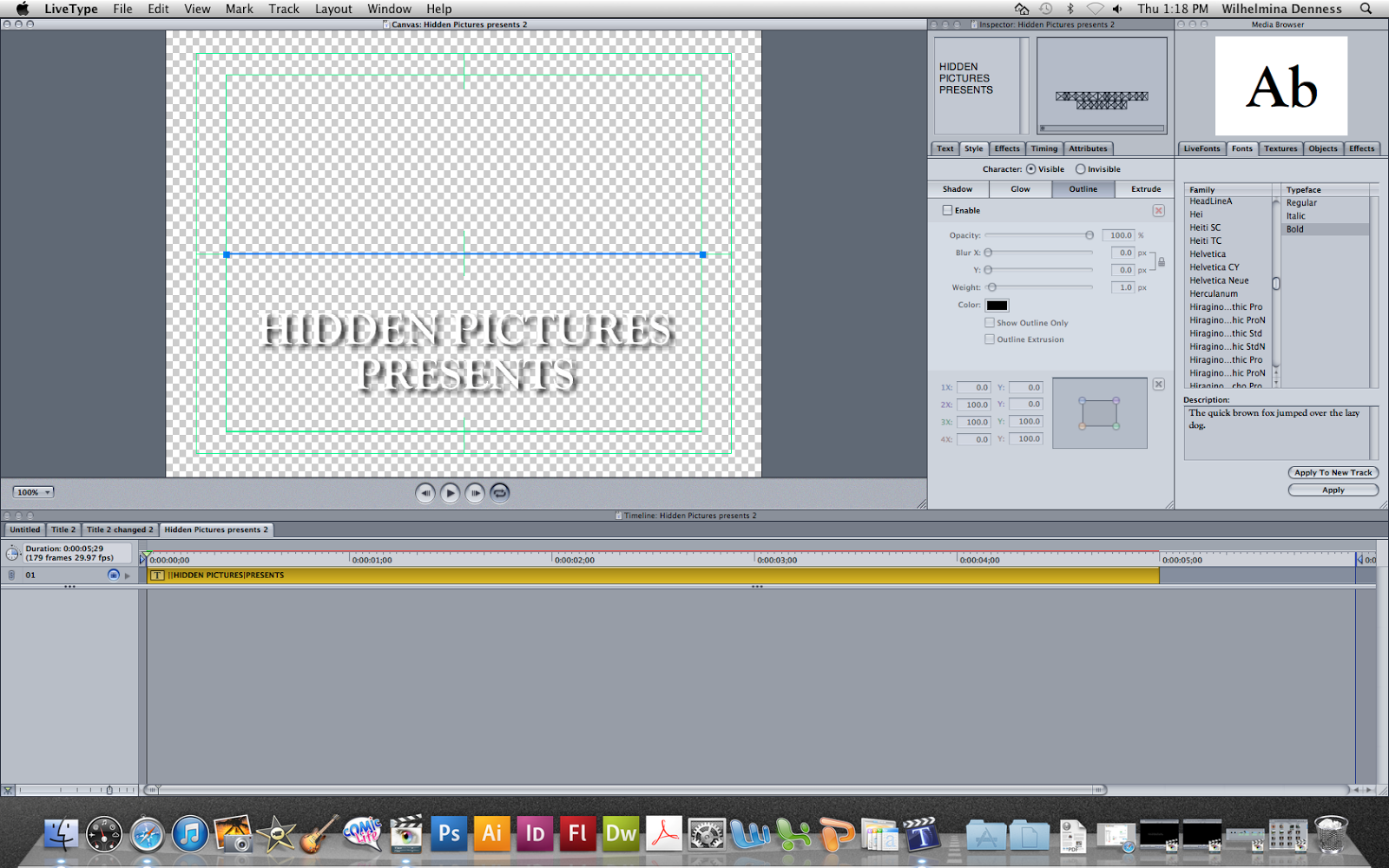
In conclusion we have gone with Goudy Old Style which in our opening will be white and will be written as it is below and sometimes all in capitals (e.g HIDDEN PICTURES PRESENTS). We think this typography will give the audience the best reading for the reasons I mentioned before. At the moment we have decided to have the typography fade in and out on the screen and will do it like that for our rough cut.
No comments:
Post a Comment