Sunday, 13 April 2014

7. Looking back at your preliminary task, what do you feel you have learnt in the progression from it to the full product? // Evaluation

In the preliminary task we had one day to produce it and I worked in a group with 3 other people.
In the film opening task we had over 2 months to go through the whole process and I worked in a group with 2 other people.

Research

For the preliminary task no research was done whatsoever. We were just given some sheets showing different shot movements and angles and a brief telling us what we needed to do. In contrast to this a lot of research was done for the film opening task which included 5 analyses of film openings, 3 analyses of supernatural horror openings and research into the supernatural horror genre.

Pre-Production

For the preliminary task very little planning was done. We probably spent about 10 minutes deciding where to film, who to film and a general idea of what shots and in what order. Whereas for the opening film task an incredibly larger amount of time was spent in doing things like location scouting, test shots, storyboards, health and safety, call sheets, props, costumes and more. From this I have learnt that putting more time into pre-production is more important as it gives you a more concrete idea of what you are actually doing and it also means you are following all rules and regulations in terms of having permission where you are filming and health and safety. This, overall, makes the whole process more professional as you're not just picking up a camera and filming what you feel like.

Production

match on action
The filming for our preliminary task only took about 20-30 minutes I would say, which is a very short amount of time. We did shoot shots we were happy with and we checked the quality of them all however I think this reflects how it was a much smaller task that didn't need to be as long. To film we used a standard tripod and a flip camera (so the quality wasn't great). However, in terms of filming I guess it was a good place to start as if we could achieve good shots with a flip camera then we should be able to get even better ones with a HD camera. We didn't think much about the lighting at all but natural lighting worked in our favour. During this task we also achieved shot-reverse-shot, match on action and we used the 180 degree rule.  This gave us a good introduction to filming sequences well and from what we learnt during this we could use similar things in our film opening (e.g shot-reverse-shot).

Shot reverse shot

When it came to filming our film opening we could use a HD camera and had already thought about match on action, shot reverse shot etc. Therefore we used what we had learnt in the preliminary task and applied it to our final product. Looking back at our film I realised we didn't exactly follow the 180 degree rule as Suzanne goes from the first room to the end room. However, as I have only just noticed this I don't think it is a problem as it has no disorientated me ever or any of our target audience so the film is still easy to follow. Regardless of this we have still learnt that in most cases the 180 degree rule is a very good thing to follow.


Post-Production

During the preliminary task we all got to grips with the two main editing softwares; Final Cut Express and LiveType. This was very useful as it meant for our opening we would be able to begin editing much faster and with more knowledge of the programme. Although, when we started editing our film opening we did find ourselves learning new skills such as adding filters and changing the speed of clips. We had to balance the roles between each other which was a little more challenging but we all worked well as a group so if someone was controlling the editing then the other two would still have full input. I personally really like editing so for me it was a bit of a downside that the role of editing had to be shared between us but I already had evaluated working alone or in a team and overall a team, if it was in a team with people I got on with (which is was), was a much better decision.

In post-production for the preliminary task I did no audience feedback. As it was such a small, short task it was not necessary. However, from doing the film opening and getting feedback at least 3 times from the target audience we chose I found it to be a very useful exercise as looking at our first rough cut of Malediction compared to our final cut I can see a great deal of improvement and a lot of this was due to audience suggestions.

Conclusion

In conclusion I can see a wide range of skills have been obtained or improved upon through the making of the film opening. These included knowledge of filming rules (match on action, etc) and how to use various editing software. I have also really learnt the value of audience feedback through the progression from the preliminary task to the full product. Overall I am happy with my progress and with the finished project as I have really enjoyed doing it all and learnt a lot.

6. What have you learnt about technologies from the process of constructing this product? // Evaluation


One downside I found from Prezi was I couldn't find how to add an additional slide without just duplicating another one so I will just write some stuff I couldn't fit in here.

The benefits of using technology in all stages of production include:

 - the ease of accessing an instant global audience (through YouTube etc.)
 - capturing film is made easy and quick with digital cameras
 - the film can be edited much quicker as it is all done on a software instead of physically
- it is much cheaper to produce your own film therefore showing a levelling out between professionals and people making films with less money as the people with less money still have access to a global audience

As well as this if we were to distribute the film it would be much easier as cinemas would be able to download it instead of transporting the physical copies which costs more and can be more stressful.

The difference between analogue and digital is that with digital comes technological convergence. This is having two or more media in one product. This is beneficial as viewers have on demand access (as they can choose to view, download; e.g iTunes, or stream; e.g. Lovefilm films and portability because of miniaturisation.

p.s looking at this now it's published I realise the writing on Prezi comes out quite small so you may have to put it on full screen to view it, sorry about that!

Friday, 11 April 2014

5. How did you attract/address your audience? // Evaluation


Some of the annotations I have made appear and then disappear of the screen so apologies for that as you may have to pause the video a lot! Since I have put quite a few annotations on this video already I thought I'd tell you about the unique selling point (USP) of the film here.

I believe the USP, for this opening, is the fact that we show the antagonist completely. Conventionally in horrors a small, insignificant part of the antagonist is shown or the antagonist does something to cause harm or worry but is not shown. We decided to show the antagonist straight away. But we believe this isn't a bad thing as if the whole film was made it might turn out that other antagonists are involved or the appearance of the antagonist gets worse over time, therefore proving that showing the antagonist in the opening does not ruin the suspense or atmosphere as later in the film there would be unexpected things.

Monday, 7 April 2014

4. Who would be the audience for your media product? // Evaluation


In the picture above I made up a person who would definitely be part of our target audience as she is a regular teenager and enjoys a variety of things but especially likes horror. Because of all these reasons Frankie would definitely want to see the film and she would probably bring along some friends too (cause she would find it weird to go to the cinema alone..).

Considering Frankie is a regular person I think it justifies how are film would suit many young adults/teenagers as most of them are regular people and if they enjoy horrors then Malediction would be a film they would not want to miss!

3. What kind of media institution might distribute your media product and why? // Evaluation


In the video above you can see a director's commentary I created over the opening which answers the 3rd evaluation question.

Saturday, 5 April 2014

2. How does your media product represent particular social groups? // Evaluation


How does your media product represent particular social groups? from katyfilmmaker

I was going to do this question as annotated photos on flickr but recently they have changed their site a little and I couldn't find out how to add notes anymore so instead I made a powerpoint and uploaded it to slideshare.

Wednesday, 2 April 2014

1. In what ways does your media product use, develop or challenge forms and conventions of real media products? // Evaluation


The Title of the Film
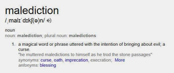
the definition of malediction
The title of our film, Malediction, can be seen in frame 9 shown on the picture above. This is the final frame in our opening and is white font we produced in LiveType with a simple black background. We thought of the title by looking up the synonyms to words on Google. We came across 'malediction' and none of us knew what it meant. After looking we realised the definition links to our film quite well as it is to do with a 'curse'. It also dawned on us that none of us know what Insidious means so the fact that we have a title that people won't know the meaning of follows the conventions and if anything develops them a bit as it adds another film to the genre that people won't know the definition of.


Setting/Location
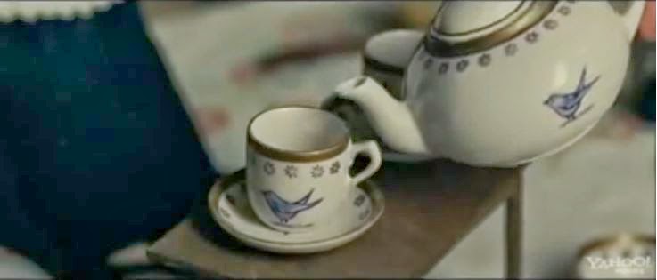
The first shot of The Woman In Black (not an establishing shot)
Our location is a fairly large house in a rural area. This follows the conventions of supernatural horrors as from my research I found that The Strangers was also set in a house in a rural area. This gives the chance for the protagonist or a stock character to be in an isolated place alone where no one else is near by and typically, as it does in The Strangers, the antagonist(s) appears and harasses them. We have put a stock character, Suzanne in this situation and introduced the antagonist. Having the contrast between the inside shots and outside shots is also something we have done that I believe uses the conventions as typically establishing shots are used at the start of any opening to set the scene. Although, from my previous research I realised that The Woman In Black has no establishing shots in the opening and just goes into close ups and medium close ups in the interior of the house. This makes me think that in some way we could be challenging this element of supernatural horror openings whereas I think for our opening it works better to have establishing shots.

Costumes and Props

We only needed to plan two costumes for our opening, the antagonist's and Suzanne Moor's. In both cases we tried to follow the conventions as best as we can while also making our film individual. Suzanne is an estate agent (she can be seen in frame 4, 6, 7 and 8 in the picture above) so we believed she should be wearing formal clothes (a black dress, black high heels, etc). In retrospect I can see that if anything her costume alone challenges a lot of real media products as generally the stock character will be a regular person in casual clothes as it allows the audience to relate to them. For example in Paranormal Activity the characters wear casual clothes throughout. In this case, for our opening, we have put the regular person in professional clothes which we see may relate to less people but will for people who have jobs.
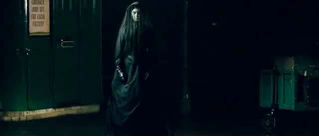

The Woman In Black wearing a traditional dress
We do, however, think the costume of our antagonist (a white dress, shown in frame 7 and 8) follows the conventions of a supernatural horror as many real media products tend to go for a Victorian twist to make the antagonist seem like a force from the past. This adds a creepy element as the idea of people who are dead now coming back to haunt you can easily freak a lot of people out. An example of a film that uses similar kinds of costume is The Woman In Black as the antagonist wears a black, Victorian style dress throughout.
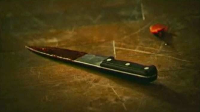
A bloody knife in The Strangers

The props we used were a doll, a newspaper cut out and a clipboard with estate agent documents on. The doll can be seen in frame 4, 5 and 6 in the picture above. I definitely think the doll follows the codes and conventions as other media products such as The Woman In Black which uses dolls as a very dominant prop throughout. We used the other props to make our product seem more realistic and believable. This is done throughout other openings for example in The Strangers a knife is shown with blood on it and there is blood on the wall which enforces the idea that the media product is real.

Camerawork & Editing

Throughout our opening we have used many shots that are used in real media products. The usual ones like medium shots, close ups and long shots are used. But as well as this the shots we used that I think define supernatural horrors are over-the-shoulder shots (as seen in frame 7 and 8 in the picture above), and shots with slight handheld movement to give the impression that something unknown is in/near the shot. These shots are both used in many film openings such as The Strangers.


Title Font and Style (Typography)
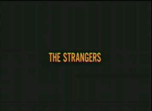
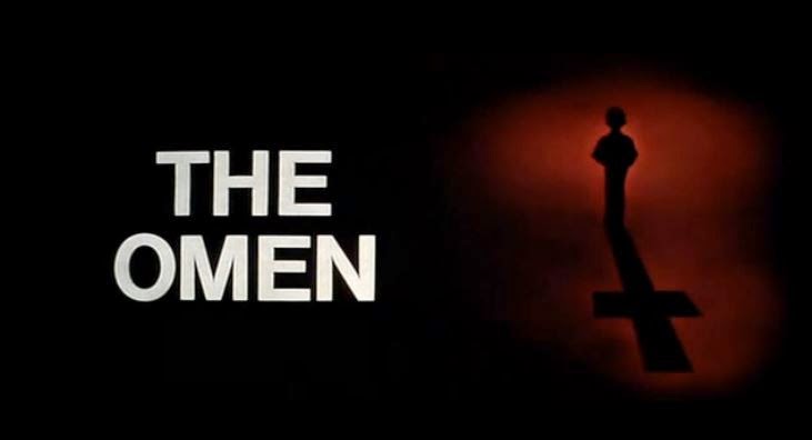
The titles of our film can be seen in frame 1, 2 and 9 shown on the picture above. The text we used is all white font we produced in LiveType. By using a simple font we have used the conventions of real media products as in various openings like The Omen and The Strangers. The Omen uses white simple text on a black background like ours. The Strangers also has simple typography used for its title and it is revealed at the end of the opening by fading in which is very similar to what ours do. I can see why this is a convention in supernatural film openings as it is very effective using the idea of 'less is more' and the fact that a crazy, busy font would distract from the atmosphere of the opening that is created with incidental music.

A conventional film opening uses titles. These usually include the production company, actors names, and who produced and directed the film. These conventions have been followed in our opening however we have slightly subverted it as we have not put in the person who produced it. Although, we do include a production company so I believe this is enough.

Story & How The Opening Sets It Up

Our story is set up in a very conventional way of a lot of supernatural horror movies. We start with writing that fades in and out on a black screen (as shown in frame 1 above) explaining an event in the past and how the causes of death are 'unknown'. This is then followed by shots of the house (exterior and then interior). One shot that particularly sets up our story is the newspaper cutting that's shown that relates to the deaths mentioned at the start. In the same shot estate agent documents are shown which allows the audience to see the house is being sold and possibly infer that someone is investing time looking into the past of the house and trying to sell it regardless of it's past. A stock character is then shown and drawn to a room on the other side of the house as the prop of a doll appeared in the distance. A diegetic laugh leads this character into a room at the end of the house and there she finds the antagonist on the other side of the room who quickly turns towards her and then after a black screen, is very close to her and screams in her face. This gives the chance for the audience to see the antagonist which challenges forms and conventions of supernatural horrors in many ways as usually only a small amount of the antagonist would be shown. For example in The Woman In Black at the end the shoulder of the antagonist is shown which works very well as the audience is more bothered by the unknown. Regardless of that I think it still works well to for our opening to show the antagonist as there is still information the audience may wish to find out about the being including where she is meant to be and why she's there, etc.
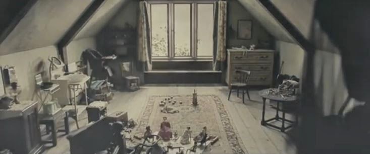
Antagonist subtly shown in the right foreground

Genre & How The Opening Suggests It

The genre our group chose was a supernatural horror. The opening suggests this greatly with the combination of slow moving shots, incidental music and a stock character which is led into a dangerous situation. An element of this happens in a lot of supernatural horrors that I have seen.

How Characters Are Introduced
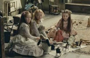
Stock characters in the Woman In Black
A stock character, Suzanne Moors, is first shown in a medium long shot at 0:46 in the opening. She is shown looking at some props which were just shown. This should allow the audience to realise that she is an estate agent as she is looking over some of her documents. Various medium shots and some close ups are shown of Suzanne throughout the opening which doesn't reveal much about her as a person but lets the audience get acquainted with her and how she looks. This uses the conventions of some supernatural horror openings as in The Woman In Black 3 children who are stock characters are shown but no proper information is given about them which leaves the audience wanting more. The antagonist is introduced with an over-the-shoulder shot (over Suzanne's shoulder) when she walks into the end room. At first we see the antagonist in the background facing away from the character. As she turns towards the camera the shot blacks out leaving the audience wanting more, which they soon get as the antagonist suddenly appears in front of Suzanne's face screaming. This, as I said before challenges conventions of most supernatural horrors as usually the antagonist isn't shown as much as we have shown our antagonist.

Conventionally in any opening the main protagonist or a stock character (or many stock characters) is (are) shown so that the audience is introduced to someone or a situation that is important in the film. For example, from my research I found that the opening of the film Hot Fuzz is entirely dedicated to introducing the protagonist. We have subverted this partially by not introducing the audience to the protagonist. Although, as far as the audience is aware the stock character introduced could easily be mistaken for the protagonist. As well as this as I mentioned before we introduce the antagonist as well who is an important character so we are following the conventions of real media products to have important people in the opening.

Special Effects

No special effects are used in our opening. We do, however use filters (colour correctors) throughout. For the outside shots we put a darker filter with very little saturation while for the shots inside we made brighter/lighter and added a slightly blue filter. From my research I found how slight blue filters were used a lot in openings like in The Woman In Black so I personally believe it was the best choice.

In film openings they will conventionally use some kind of filter to portray a mood. Special effects are used depending on the genre of the film. For example an adventure film will probably use special effects.

Saturday, 29 March 2014

Malediction - Final Cut

Here is the final cut of our film opening Malediction. Despite one continuity error (that no one seemed to notice) where are bags/equipment are in the background then they aren't I'm very happy with it and I hope you enjoy watching it!

Continuing Editing (Improvements)

The next day (Thursday the 27th of March) I was in school so I got to work with Wilhelmina and Indya on the rest of the improvements.

We acted on the feedback about filters by making the shots outside the house darker and the ones inside lighter.

As well as this we improved some of our titles.

Editing some of the titles
'HIDDEN PICTURES PRESENTS' was one of the ones we thought needed most improvement as the white 'H' cannot be seen very easily because of the sky which is also white. To improve this we added more of a black shadow effect and outline which improves this greatly compared to how it was.

We have also repositioned 'A Paranormal Production' more to the right so the text does not go across the side of the door and we have moved 'Directed by Katy Jackson' to the right a bit so it does not touch the character Suzanne.

Near the end of the lesson we exported the final version of our film opening!

I was ill!

Unfortunately on Wednesday the 26th of March I didn't come into school as I felt very ill with a bad cough and cold. This was incredibly frustrating for me especially since I have also been to Manchester recently so I feel as though my contribution to the group is lacking.

When I was gone Wilhelmina and Indya made some of the improvements that were given to us previously. The improvements they made included building up the sound more at the end by adding another soundtrack that subtly makes the sound feel thicker and as though you're building up to more of a climax in the opening.

As well as this they asked our teacher and another member of staff for some feedback.
The feedback they got was as follows:

- Cut down the shot of the antagonist screaming
- Make some shots shorter because at times the camera jolts
- Slow down the establishing shots at the start

Indya and Wilhelmina did all these things. They mentioned to me when I got back the next day how at 0:57 the sound suddenly reduces in volume quite a bit. None of us our sure why it does that or how to fix it so we will just have to leave it as how it is.

Friday, 28 March 2014

Malediction 3rd Rough Cut - (Further Audience Feedback)

As I mentioned in my last post one of the people we last interviewed (James) has a sister who is at Nottingham Trent University studying Design for Film and Television. When James told us about her we thought it would be an excellent opportunity to get feedback from someone who was studying at University and still within our target audience. When she came back from University for the weekend James showed her our 3rd rough cut.

The improvements were as follows:
  • The shots outside the house should have a darker filter.
  • The shots inside the house should have a lighter filter.
  • The diegetic sound of the door opening should be made slightly louder.
  • When Suzanne is approaching the room where the antagonist is the music should build up more to enhance tension.
She did however say our film opening was very good for an AS Level piece of work so we were pretty happy with that and her constructive comments. 

Monday, 24 March 2014

Malediction 3rd Rough Cut - (Audience Feedback)


The other day we collected audience feedback for the 3rd rough cut from different people (who are still our target audience).

From this video you can see no improvements were given to be made. Luckily for us James (one of the people in this video) has a sister who does work involving film and she will give us feedback soon which should definitely include some improvements.

Wilhelmina edited this video.

Saturday, 22 March 2014

Malediction - 3rd Rough Cut


This is the 3rd rough cut that Wilhelmina and Indya produced on the Thursday lesson when I was away. They used the improvements given in the audience feedback.

These included:

- incidental music building up in volume at the end
- the diegetic sounds (door and laughter) not being too loud
   and more.

As well as this Wilhelmina told me they asked someone in our class and they suggested to have 'Wilhelmina Denness   Indya Clayton' instead of 'Wilhelmina Denness & Indya Clayton' as movie openings don't tend to include an '&'.

In addition to this Indya and Wilhelmina added a more noticeable dark filter which I agree with as it makes the opening seem more eerie.

Friday, 21 March 2014

Been In Manchester!

From the 18th of March to the 20th I was away on a Geography field trip in Manchester. This meant Wilhelmina and Indya had some time to carry on with our opening without me. We had already prepared for this as we discussed what they would get done when I was away and now that I'm back I'll take a bit more of a lead to make up for being away.

When I was gone they did more editing and have exported Malediction - the 3rd Rough Cut. This will be revealed in my next post!

Monday, 17 March 2014

Malediction - 2nd Rough Cut (Audience Feedback)


In our last Thursday lesson we randomly selected 4 boys and 4 girls of people who were within our target audience. They watched the 2nd rough cut of our opening for the first time, we asked them questions and they answered.

Wilhelmina edited together the video shown above which shows all the questions and answers.


Malediction - 2nd Rough Cut


We decided to show our rough cut to our teacher as she had not yet seen any of it. She liked what we had done but also gave some initial improvements to the editing to make it seem more professional. These improvements were as follows;

  • fade in and out more on the diegetic laughter sound
  • make the clip a bit longer near the end when the antagonist is shown and turns around
  • make the section where there is just a black screen at the end a bit shorter
We did all these improvements as we agreed with them and exported our 2nd rough cut which is shown above.

Sunday, 16 March 2014

Malediction - 1st Rough Cut


After all of our editing sessions this is the first rough cut we produced! We edited to a standard we were happy with but didn't look too much into tiny details that we weren't so sure about as we figured this was good enough for a rough cut and the fact that there is a lot of room for improvement is a good thing.

Saturday, 15 March 2014

Exporting Difficulties

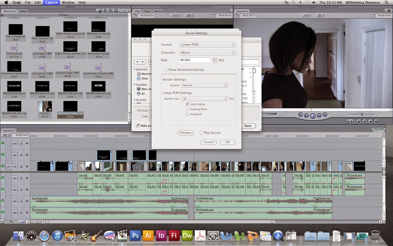
We have had very little problems when editing our video however when we came to export it, it automatically exported it as an .mov file which we didn't see as a problem until we realised we couldn't play this file format in our own homes and we couldn't upload it to YouTube.

Because of this we had to find a way to export it into a file that was compatible with our computers/laptops at home so that we could upload it to YouTube.

These pictures show how we managed to get it to export. We continued to do this for the rest of our videos.

'Malediction' Title Feedback


In our lesson on Thursday we went around the students in our class (as they are all within our target audience) and asked them which font they preferred for the typography for our opening supernatural horror film opening. These were the results we got. I have decided to display them in a stacked column chart to make them easier to see.


From these results I can see that number 1 and 4 are the least popular and therefore will definitely not be used. Number 2 is the most popular followed by number 3.
 
For our rough cut we have used number 3 which we all easily prefer and is the 2nd most popular from our results. We take into account the fact that number 2 is the most popular but we all think there's a bit too much going on and it's better for it to be simple. The opening is set in an old house with themes of old, possibly Victorian things (e.g the doll, the antagonist in the simple white dress) so we think the typography should reflect this.
 

Friday, 14 March 2014

Conventional Titles/Credits - do our titles/credits follow the conventions?


For our titles/credits to be successful we want them to at least broadly follow the conventions of horror film openings as it will make our opening seem more professional and realistic.

I stumbled across the film Dolls when looking at various title sequences for movies. Dolls is a 1987 horror film set in the English countryside where some people stop by a mansion during a storm and find haunted dolls in the house. This has some aspects similar to our storyline (the English countryside, the doll in the house) so I realised the typography and what it says is likely to be similar or follow a similar structure.

It starts with 'Empire Pictures Presents' which fades in and out of the screen. This is pretty similar to ours and from looking at other horror openings I can see quite a few films go for this as a starting point.

It then goes on to show the production company (or in this case who produced it) which ours also does.

After this the main title is shown. By looking at other horror movie openings I have found that some do this where the opening is simply a lot of credits, while others that have action/characters in their opening tend to put the title of the film at the end like we do.

This opening then goes into more detail (e.g who stars in the film, who does the doll effects, etc.) Ours shows two people who star in it by just writing their names but does not go into anymore detail. I think this suits our opening and follows the conventions for openings with action in because as I said before the emphasis is on the action and not the titles so much.